29 May 2006

[distractions] The Outfield's First New Album in 14 Years

Back in the Eighties, it was, bassist Tony Lewis sang in a clear, bright, strong voice:
Josie's on a vacation far away,
Come around and talk it over
There's so many things that I wanna say
You know I like my girls a little bit older
I just wanna use your love tonight,
I don't wanna lose your love tonight...
That song, from the album Play Deep, got big play on the radio and on MTV that year, as did a couple other cuts from it: "All the Love In The World" and "Everytime You Cry".

Hailing from London's East End, and at first calling themselves "The Baseball Boys" (after that gang out of that bizarre move The Warriors), bassist and singer Lewis, budding guitarist and songwriter John Spinks and drummer Alan Jackman renamed themselves to "The Outfield" when they decided the original name evoked too much of a negative image.

While thier sophomore effort, Bangin', got little notice as I recall, the third album, Voices of Babylon, rendered a very memorable title tune that gets under your skin and stays there. Through subsequent releases, Diamond Days and Rockeye, Spinks' production and musicianship gained polish and Tony's voice remained distinctive (even as the band lost Jackman), and the band forged ahead even though old Moe Mentum was trying to swing the other way.

As a band, The Outfield get little respect I find. I myself came to them late, but I have trouble finding good entries on them in rock music chronicles. This is highly unfair. They have done cool, fun, rocking music that's also accessable while remaining passionate, all the while staying straight-ahead, guitar based rockery that has enough hooks and neat melody to get attention.

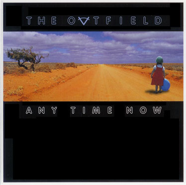
The band itself is still together, and fourteen years on from Rockeye (and six years since the interim Extra Innings (Unreleased) comes the enticing, tune-filled Any Time Now. For the past two weeks it's about the only music I've listened to.

The hooks, good melodies, and compelling lyrics are all there, also the hintings of rockers well into thier forties thinking about the world and politics and the future, but also radiolicious bits such as what would be the ready-for-radio album signature "It's All About Love", the sedcutively arranged "Photograph" (this one in heavy personal rotation), and the world-aware "Wasted", "Rainbow's End", and "Peace".

I so totally dig this album. Being an Outfield fan has been a frustrating experience of longsuffering, with a band that never tours outside the southeastern US, and an aloof fan club. Getting this album is like a dash of water in the middle of the desert. Some obvious production problems are evident (there are abrupt cuts on the ends of fadeouts) but the music is just as strong, as well written as Spinks has ever done, and Tony Lewis's clear, high voice still ranks with me as one of the most remarkable in rock music.

Any Time Now, flaw included, is tasty enough that it leaves me hoping they'll release more. And not after another fourteen years.

Technorati Tags: , , ,

28 May 2006

[design, web_design, ethics] designplagiarized

Stumbled on this wonder today, tripping upon the witty and wittily-designed (and magnificently-executed) design chronicle pull to inflate.

It has developed that a design firm calling itself "designinspired" put up a website that was rather well designed. It couldn't help but be; it apparently was lifted, right down to the CSS and the copy text, from the Duo Consulting website. Read Adam Howitt's account of the theft here, complete with damning evidence.

I occaisionally think of having to be creative on demand–it is rewarding but also wearing just a little bit. Nicking a design concept here and an idea there sometimes is damned tempting, but this, as I've said to someone recently, is one reason why we thumbnail, thumbnail, thumbnail.

Anyway! Some people can copy just a little bit and it becomes inspiration, because you use what you've seen to create something that is inspired but different. But what do we make of someone who's so short on an idea that they simply lift a complete design from someone else, then put it up on the web, thinking nobody would notice? Quark, Inc. learned this one the hard way.

Seriously. I'm still scratching my head on this one.

Exculpatorily speaking, the design firm in question has taken down the website and issued an apology for the theft (realizing that the chief export of Chuck Norris is pain. Nobody has checked with Vin Diesel to find his feelings but I'd bet he'd be similarly moved). All that remains at http://www.designinspire.com is a "coming soon" card:

Now, that just seems familiar...where have I seen that before...

Naaah. Maybe it's just me seeing this...

Postscript: Brady J. Frey, proprietor of pull to inflate, makes two cogent points which rather stand on thier own. Firstly:
If you’re a client or potential client of Design Inspired, I’d ask yourself this: If a company will rip it’s own designs from other designers, how unique will your product be from them? What exactly are you paying for then?
This comment stands on its own, and touches on the subject of originality that I myself have been exploring lately. Then, wittily:
Maybe it’s just me, but when I see the term ‘inspired’ within a design companies title, I almost always become suspicious — it’s akin to a car sales man asking me to trust him… if you have to showcase the meaning, you’re aware the fact you’re blatantly lacking within that very description.
No, it's not just you. It's kind of like that unwritten rule that anytime a rock'n'roll song or album actually includes the term rock'n'roll in its title, then you just know it's trying too hard.

Word.

27 May 2006

[design] Does Stock Suck?

Gently wafting my way this last week were numerous opportunities to consider the concept of originality.

A discussion on the Graphic Designers Resource Group at Yahoo! Groups inspired me to write this piece over on Designorati regarding the thought of using clip-art as the basis for a logo design. My short take: while there may seem to be good reasons of the moment to do so, clip art for logos is a terrible idea.

Somehow, also, I stumbled on a link to a great (and knowingly funny) piece on the Forty Media site: Top Ten Stock Photography Clichés. A title like that just begs to be read, so go do it already.

The article was found via this post at the About Desktop Publishing blog, maintained by another member of the Legion of Triply-Named Designers, Jacci Howard Bear. And, with respect to About DTP, on Designorati I did an overview of the free open source layout app Scribus, which she also linked to (thanks, Jacci, that did happen to brighten my day!)

This (and following a few links on this post at About DTP) has gotten me ruminating on the nature of the stock image beast. Stock is big business (just price some) and a lot of designers use a lot of it.

Actually it makes sense in many venues. But does it undermine the creative's milieu in the end?
The weak spot, as I see it, is well expressed by Jacci, if I may quote her:
If you are pulling your images from some of the most popular clip art packages or from shareware and free collections on the Web then chances are that you will see the same images popping up on fliers, in ads, or gracing newsletters and Web pages.

Royalty free illustrations and stock photography are relatively inexpensive. Their ready availability is what makes them attractive and what makes it likely that someone else will use that same image. You have to ask yourself how likely it is that someone else, including your competitor, will use the exact same image and how much will it matter if they do.

One of the goals of a design is, in many applications, to be memorable. There are situations, I suppose, that one would actually want to design toward a common, unremarkable vocabulary, but I can begin to see how the use of stock might actually contribute to a banalization of our cultural design vocabluary.

I am someone, however, who has a modest digital camera, average illustration skills, and can compose a picture and frame a shot. I, Samuel John Klein, am a multiple design threat.

I can do it all.

25 May 2006

[liff] It's Towel Day


Celebrate, Celebrate. Get your towel, wear it out and wear it proud. Do you know where your towel is?

From The Hitchhiker's Guide to the Galaxy:

A towel, it says, is about the most massively useful thing an interstellar hitch hiker can have. Partly it has great practical value - you can wrap it around you for warmth as you bound across the cold moons of Jaglan Beta; you can lie on it on the brilliant marble-sanded beaches of Santraginus V, inhaling the heady sea vapours; you can sleep under it beneath the stars which shine so redly on the desert world of Kakrafoon; use it to sail a mini raft down the slow heavy river Moth; wet it for use in hand-to-hand-combat; wrap it round your head to ward off noxious fumes or to avoid the gaze of the Ravenous Bugblatter Beast of Traal (a mindboggingly stupid animal, it assumes that if you can't see it, it can't see you - daft as a bush, but very ravenous); you can wave your towel in emergencies as a distress signal, and of course dry yourself off with it if it still seems to be clean enough.

More importantly, a towel has immense psychological value. For some reason, if a strag (strag: non-hitch hiker) discovers that a hitch hiker has his towel with him, he will automatically assume that he is also in possession of a toothbrush, face flannel, soap, tin of biscuits, flask, compass, map, ball of string, gnat spray, wet weather gear, space suit etc., etc. Furthermore, the strag will then happily lend the hitch hiker any of these or a dozen other items that the hitch hiker might accidentally have "lost". What the strag will think is that any man who can hitch the length and breadth of the galaxy, rough it, slum it, struggle against terrible odds, win through, and still knows where his towel is is clearly a man to be reckoned with.

[design] QuarkXPress 7 Is In The Wild

On 23 May, the long-awaited QuarkXPress 7 was released by erstwhile DTP king Quark, Inc.

It, as I've intimated here, boasts new features:
  • Transparency ("color-level" transparency)
  • Composition Zones, which allow for mulitple layout artists to work on a single document.
  • An improved interface, with dockable and undockable floating palettes and a much-improved context sensitive Measurments palette, allowing users to approach an InDesign-like experience (access of most all functions through palettes), but enough like the traditional Quark UI that Quarksters don't have to change thier ways.
  • Job jackets, which enable project specifications to travel with the file itself.
  • And the most unique feature, for Quark: a street price of $749 (about $250 less than previous versions) and an upgrade price of $249, regardless of version, from version 3 through version 6.5. As Sandee Cohen points out here (at CreativePro.com) that's a significant improvment from earlier, where Quark charged you more depending on the age of the version you upgraded from.
The importance of the apparent new price philosophy should not be underestimated. One of the most frequent complaints about Quark's flagship is the high initial price-more than $1000–especially in a world where Adobe's Creative Suite offers vector and pixel illustration (Illy and PS), Acrobat for bashing up your PDFs and GoLive for taking it all on the web for just a fistful of dollars more.

The only competition for QuarkXPress 6.5 wasn't Adobe, though...it awas also QuarkXPress itself, specifically QuarkXPress 4. 5 wasn't recieved well and 6 didn't compel. The new XPress looks like just the sort of XPress that Quarksters have been wanting, and should keep committed Quark fans "on the rez".

Of course, because of past sins, Quark has lost a lot of former users; it's position at the top of the DTP heap (enterprise and single user) can no longer be seen as secure. Adobe's insurgency has kicked Quark in the ass, and after the cool reception 6 and 6.5 got, Quark finally brings it with 7.

I wouldn't expect this to be the InDesign "killer" (an ironic term, that), however. The shops and indviduals that have switched to Adobe aren't likely, given the many reasons why they left, switch back to Quark. I personally wouldn't say that XPress has pulled even with InDesign, exactly, but XPress 7 will keep Quark in the game...and keep Adobe innovating.

Having used both, while QuarkXPress 7 is a very good product now indeed, the company that makes it still has to stay on the game to keep up.

Really, regardless of whether or not you're a hardcore Quarkster or an unabashed InDesignista, we're all gonna win on this one. Quark's going to keep Adobe on its toes, and back the other way as well.

Quark, Inc: http://www.quark.com
QuarkXPress 7: http://www.quark.com/products/xpress/

24 May 2006

[design] Redesigning Cherriots: Part 6: The Key and The Frame

This is part six in a series. For Part 1, Go herewise; for the last chapter, here.

Now that I've got a lot of what I want on the ground, I'm wanting to give key information to the map.

The primary informational point of the map, the lines, are numbered and can clearly be seen, but they have, in Salem, historically had names, and the names are important too (as well as give the map a local character. They have cool names such as "12th and Sunnyside", "State & Fairview", "Laurel Springs", &c. This information is also prominent on the signs of the buses themselves, so the cross referencing is important on the abstract informational level.

So, I set about making a route list, and the best way to map the information in the key box to the information on the map itself is to copy route number icons from each route on the map and match it to a one-to-one list. The first illustration shows how I've done it. There is also a scale bar, to give the reader an idea of how much distance a mile actually is (as well as give anyone using the map a way to ballpark how much time they'll need to get to the nearest bus stop) and the required North arrow (because nothing says map more than the presence of a North arrow). The North arrow is also created as an Illustrator symbol and saved to the symbols palette.


I also wanted to dress up the frame that I laid in behind the map in the last step (though I hadn't mentioned it, the map is easier on the eyes when the background is neutralized, thus the gray tone of the background box). I also had a little problem: the ends of the paths were, of course square with the axis of the paths, and that made it feel unfinished.

The answer I arrived at can be seen above. Taking the N out of the North arrow and scaling it down, it was a simple matter to lay them on the map margin, and with destinations beyond the map indicated, it becomes a way to give an idea of Salem's place in the region (as well as, with the routes to Oregon Garden, Oregon Coast, Silver Falls Park, Detroit Lake et. al indicated, a quick guide to regional attractions).

After distributing these appropriately around the edge of the map, I have the following:

Once again, I have to say, I like the progress of it so far. It's really looking kind of slick, I think.

Next, I'll be adding some more key information–as well as starting work on an inset map for downtown.

23 May 2006

[Address_Nerd] Portland Signs: N. Benton Avenue

North Benton Avenue signs, courtesy of the lovely and talented Stan Kost.

North Benton Avenue is a short street, limited to just a couple of long blocks just north of the Rose Quarter. It runs parallel to the Willamette River, as it was part of the original plats of the city once known as Albina, and crosses N. Broadway just before the intersection with Interstate Avenue and the Broadway Bridge.

It defines the 400 block on N. Broadway.

Benton is a name which looms large not only in Oregon and the Willamette Valley (we have a county named Benton, centered on Corvallis) but in the American West (there is a Benton County we're familiar with in Washington state and some others in other states).

The man who it was named for, Thomas Hart Benton (1782-1858), was a United States Senator from Missouri who served for thirty years. He and a certain Senator Lewis Linn, also of Missouri, were strong advocates for the inclusion of the Oregon Country into the United States. He also advocated for the Donation Land Claim system, which allocated free land to settlers coming to Oregon, thus forming the basis for a great deal of settlement in the Valley (the city of Portland's original land covered two DLC's, one which today is downtown Portland south of Burnside, the other Old Town and central NW Portland.

Today the main function of N Benton Avenue is to allow access to the parking garages north of the Memorial Coliseum along Broadway and the Portland Public Schools headquarters building, which is located along N. Dixon Street, one block north of Broadway, via Benton.

The photo up top contains two blades, which illustrates a notable style variation. Typically the street type is two letters only, in this case it would be "AV" (as on the left). The sign on the right uses a three letter abbreviation, "AVE". This is nontypical style for Portland street blades.

17 May 2006

[design] InDesignSecrets.com goes live

Rejoice, InDesignistas! David Blatner and AnneMarie Conception, two of the hottest InDesign gurus going right now, have débuted a must-bookmark site, InDesignSecrets.com.

It's just started, but tune in. When they give this stuff out for free (including the podcasts), you want to be on board for this stuff. Having dialed in to a couple of web seminars from David, I know for a fact he's a great communicator. To those who know thier gurus, AnneMarie should also need no introduction.

The current post details the peek InDesign Conference members were given to the upcoming InDesign CS3, due to ship next Spring.

We say, check it out. We've added it to our blogroll, in the "Tools & Inspirations" section.

15 May 2006

[pdx_cartography] My Map of New Columbia

Check this out, my people:
Click upon, of course, to see it bigly.

Tired of trying to find a single official map of the area called "New Columbia", I visited the invaluable PortlandMaps.com and used those maps (your tax dollars at work, people!) to create my own map of the area.

Looking at an old map of the area, Woolsey Avenue and Wollsey Court made big lazy loops that looked kind of like a big lima bean. All that is gone now, replaced by a compact little grid bend a little askew from the cardinal directions. Not a bad idea, really; I understand the area is very lovely now.

The map was built in Adobe Illustrator CS2

[design] How To Estimate a Job

Independent designers, especially new ones, sometimes find estimating a job to be an intimdating experience, at least until you get the experience. We wonder how much we should ask, thinking that maybe there's a menu list of typical prices somewhere.

There are guidelines and accepted practices (thanks to such trade groups as the Graphic Artists Guild) and there are standard prices for some things but in all estimating includes not only knowing what prices are but also what you expect to do. Of course Murphy's Law enters into it, because you can budget tightly but something unpredictable can still happen

The best way to approach it would seem to be understanding it, like everything else in design, as a development process. You gather all the information you can get and it informs decisions one makes. It's not so much a menu-list as it is a set of problem-solving tactics that form a coordinated strategy.

As a budding independent myself, then, I was thrilled to find that illustrator Mark Monlux has assembled a clear and straight-ahead flash slideshow that enables the tyro to get thier head around estimating jobs. This is good stuff and can (and should) be seen here.

12 May 2006

[pop_cult] Mission:Unwatchable

Since me and The Wife™ are Mission:Impossible fans from Back In The Day™, we watched the debut of the M:I "franchise" (and, since when have a two-going-to-three movie series qualified as a "franchise"...or do people just like using that word) with a bit of trepidation.

After all, here's someone who's acting we liked but were disturbed by just about everything else about him (of course I mean the inimitable Mr. Cruise, and we feel history's vindicated us on that point) and he was going to make a major motion picture out of a series that was one and a half of the top two series ever done.

I can say this with confidence: our bona fides include about eighteen hourse of Mission bought legitimately and at least twelve (if not more) hours of eps 'legged off of the FX network about ten years back.

So what happens? Jim Phelps turns out to be a traitor and dies, and Ethan Hunt (who seems to be a postmodern version of Rollin Hand with a bit of Paris dashed in there for spice) becomes "disavowed", which apparently is actually a subclass of IMF operatives who somehow live without being constant targets of assasination. Who knew? But on balance, the series vibe seemed to be there somehow, especially in the end when Ethan Hunt is given the mission tape aboard a plane and there is a sense here of the torch being passed.

Also the scene in the Channel Tunnel kicked teh ass, major ways.

M:I II proved that if the torch had been passed, the new bearer picked it up by the wrong end, burned himself, put it out, then ran with it in the other hand and didn't light it up again. The reviewers called in Mission:Cruise. My The Wife™ pronounced it unwatchable, returning it to the video store after watching it a mere fifteen minutes. She likey her action flicks; she likes Hong Kong-style action films; loves John Woo; hated, hated, hated M:I II. Go figure.

Now, we have M:I III, or as I like to think of it, M:I AiYiYi. We haven't gone to see it and were're not going to.

And why can be be so sure?

Peep this article and you'll understand why the Cruise-rendered "franchise" isn't really worth your time. This writer says it a whole lot better than I ever could.

10 May 2006

[design] Redesigning Cherriots: Part 5, Now It's Just My Type

This is a multipart saga: follow the chain backwards, if you want, starting here.

Last issue I mentioned how what the next thing I want to do is typography. I have all he geographic elements I need to make the map informative, now I want to begin labelling things.

It didn't take me too long to decide on a typeface to use for the labelling: Gill Sans. It seems to be very popular of late but not quite to the point where it suffers from the dreaded Helveticitis.

It is actually quite suited to such uses. It's intellectual forbear is a font called Underground, which was developed by Edward Johnston in the 1930s specifically for and for the use of the London Underground. Gill Sans was developed by Eric Gill, a stonecarving/type designing titan of the mid-20th Century, and it seems to be an updating of Underground with subtle humanist touches (the voluptuous curve on the leg of the majuscule R make it one of the most beautiful glyphs in any typeface).
The type was applied where appropriate to the streets, and to give a better impression of the lay of the land, two subclasses of notations were made:
  1. Important districts were located and labelled. Two sizes of type were used to indicate hierarchy: a more modest style for notable neighborhood-sized areas, and a larger one for significant centers within the urban fabric (these I deemed West Salem and Keizer)
  2. In very large type, the five Salem address districts: N, NW, NE, SE, S. This has been a feature of TriMet maps for a long time, and I added them here because I like the look there. The type was left dark but was placed in the stacking order at the bottom so that any streets and line symbols would overlap them–this is another way of making something prominent, yet making it go to the background. Literally, in this case.
Below you'll see a clipping out of the middle of the map that'll give you some idea of what the detail is like:
Click on either image it to see them bigly.

[metro_transit] And Here's Where The Bus Routes're Gonna Go

Well, like it or not, here it comes: the Portland Mall's extreme makeover. And as you've heard in the news, the buses are going to move off the Mall during construction, mainly to NW and SW 3rd and 4th Avenues and Jefferson and Columbia Streets.

TriMet has today announced the online availability of a map that will tell you exactly where everything's going to go.

Good on them for making it available, but I'll tell ya, it'll make you wish they'd bring back the sector symbols.

[open_source] Got My OpenOffice.org 2.0

One of the cool tools which I keep about is a nifty office suite called OpenOffice.org. Derived from Sun's StarOffice suite, it's open source, and it's free.

And it's stylish: just look at the document icon to the right there.

That's right. As in, you don't pay a dime for it. You just have to download it.

There's a version for Windows, for MacOS X (requires X11 but if you have 10.3 or later you'll likely have that) and for Linux (requires Xwindows as well).

It's a suite that includes a word processor (Writer), a slide presentation editor (Impress), a spreadsheet (Calc), a vector drawing app (Draw), an equation editor (Math), and an SQL database (Base).

I don't need to use all that stuff but I have used OOo since about version 1.1.3, and it makes (at least for my needs) any MS Office completely unneccssary. It not only groks MS Office files, reading and saving as .doc, .xls, and .ppt formats, but conforms to the XML-based OASIS standard...any application that will read XML-based documents will talke to OOo.

This is a great app for those who want to de-MS thier home computers, those who need to exchange documents with Word users who can't get MS Office, or anyone who has a copy of Office that has, we might say, a checkered provenance.

Check it all out here
.

At least, since it's free, it's worth looking over.

08 May 2006

[metro_transit] Attention TriMet Riders–An Armful of Service Changes

This just in the the inbox: a friendly mailing from TriMet detaling a flock of service changes.

There's MAX Maintenance, changes due to construction on the Mall at Meier & Frank Square, changes in the routes approaching Clackamas Town Center due to the construction going on there, and time adjustments aiming at improving system performance, or so they say.

If you ride TriMet, there are enough they might affect you. If you use any of the following routes or stops, check them out:
The following routes have major changes, mostly due to construction:
So if these affect you, go, get the info.

[Address_Nerd] Yet Two More Pix of the Stark/Leahy/Cornell Area, Presented with Minimal Comment

Two more pictures of signs in that area we've been exploring:

This sign is seen by one who is west/northbound on Leahy, just as one comes up to a store on the corner and just past the elementary school. I completely dig this.

The "SW Taylor St" name is the logical extension of the name from the Portland city center, though it's effectively a few blocks north of where it is downtown–500 block vice 900 block–as Stark Street in this area is also that other street's logical extension.

Just one bit of advice: Don't tell the officer you didn't see the sign.

And this is where West Stark (here obviously mislabelled) nominally crosses Barnes Road, about 2/3 of the way towards the Saltzman Road junction as you go away from the Peterkort area at Barnes and Cedar HIlls Blvd. The style of the type and the relative sizes are a bit off the normal style for street blades in that area.

This section of street is extremely brief, only about 50 feet long if that, and serves as a place for a couple of driveways serving the properties on that side of Barnes to tie in at a single spot, and a slightly off-street place to put mailboxes. The trees in the distance are part of one of the Teufel Nursery locations. There is an entrance to that property directly across Barnes from here, such that it lines up, but it clearly is not an extension to the public road.

07 May 2006

[design] QuarkXPress 7 Universal Binary Public Beta is now Available

Recently, Quark, Inc. closed it's Public Beta test program after the release of two test versions. Both Windows and Mac users had the chance to assay what the former king of the DTP hill had to go up against the Adobe Creative Suite adversary.

However, it's not quite closed yet, not for everybody. Quark now has up a Universal Binary Beta, that code that is intended to run both on PowerPC Macs and the new MacIntel (you might say "MacTel" Macs.

In contrast to the other two public betas, which were time-bombed to expire on certain days, the Universal beta is set to expire 60 days from the date of installation, behavior more like a free trial version, and twice as long as the It's up on the Quark Public Beta download page now, and registration is free and open to all as before; go to this page to do it.

Clocking in at a Brobdingangian throw-weight of 225 MB, I'll have to find me a broadband connection to sample this lovely.

(I wrote about it on QuarkVsInDesign as well)

05 May 2006

[design, type] A Type-like Aside

Just FYI, sometimes I check in on my own blog to pump them itsy numbers up to just get a look at how it looks on other 'puters.

Usually not so good. I prefer, as all civilized beings ought to, Gill Sans, and that's what the lead entry in the font set in my template is. Truly, the computer of the enlightened individual simply has Gill Sans on it, no need to check.

So, to see these words as I done intended for my tens of readers per day, please install Gill Sans forthwith.

That will be all.

03 May 2006

[design] Redesigning Cherriots: Part 4, Putting Some of the Pieces Together

For Part 3 of this saga, surf this link. Part 3 links to 2, and 2 links to 1.

The developement of the Cherriots System Map continues apace. To see what I've got going so far, I'm putting some of the individual toys I've been playing with together to get some sort of idea of what direction I'm going in. So, making sure that all the basic route alignments are in place, I turn on the layer with the route number icons, nudge all those into position where I want them, and here's what I have:


Click on the map to see it bigly. There's not much to say about the changes themselves that I've already said, but I do think I'm not being presumptuous to say that the polish of the map has much improved. There was a cöordinated strategy of improving readability and informational content that is starting to pay off. I'm so far rather pleased with the improvement work thus done.

To give an even clearer idea of how far I've brought the design, let's do a little side-by-side, before and after, hot map-on-map action:


The downtown area looks a whole lot better: I was bothered by the disorganized feel of the original. I simply like the look of the new route numbers. The street labels are still not there, but we'll be moving on to that very soon now. The river's route through the map adds both interest and information in a two-for-one deal. And, not least, the insistence of accuracy adds a certain perception of attention to detail that comes through to the viewer.

Next, what I've all been waiting for: typography.

[net_life] Net Neutrality: Tim Berners-Lee speak...

...you listen.

Net neutrality: it's not just good public policy, it's good business.

(via Eschaton)

02 May 2006

[net_life] Net Neutrality: Rep Markey Makes it a Federal Case

This just in via Alternet and Eschaton: Rep Ed Markey, the Democrat who introduced the Markey Amendment to preserve Net Neutrality in committee, has introduced the Net Neutrality Act of 2006.

The News Via Alternet.

The Complete text of the Act as announced by the office of Rep. Markey (Via Free Press).

If you're the little guy, then you have an interest. Get interested.

01 May 2006

[design] QuarkXPress 7 Public Beta Program is Ending

As announced by Quark in email to its many public beta program participants, the public beta program is coming to a close. The XPress 7 Public Beta 2 is set to time-bomb on 2 May, which means sometime in the next 24 hours, your copy of it will refuse to run.

If you're one of those of who have the taste and discernment to run Mac OS X you do have some more time to play, though. Also in its email, Quark says they will be mounting a Universal Binary Public Beta 1, but not when: it's not up on the beta test program page just yet.

But I will post an announcment at QuarkVsInDesign.com when it does happen.

In all, Quark has improved its flagship high-end page layout and design program quite a bit. InDesign challenged them to bring it and they did. However, I remain unconvinced that this will position Quark ahead of InDesign in terms of power and capabilities. It may be seen as an evening up; it has better PDF, more image manipulation, an improved interface (I'm very impressed with the new palettes), and more ways to do what you want to do (you can do just about everything with a floating palette now...it's almost InDesign like).

This won't woo refugee InDesignistas back; it might, however, stanch the flow of Quark users leaving XPress for InDesign. But then, maybe not; the Adobe Creative Suite offers integration with Illustrator and Photoshop that Quark could, by its very nature, never provide.

But then, PDF Import and QuarkVista provide image geeking that your Quarkster who doesn't Photoshop much will love.

What can I say? Well, what I usually do...for those who like this sort of thing, this will be just the sort of thing they'll like.

Quark Inc: http://www.quark.com
XPress public beta program: http://www.quark.com/products/xpress/seven/beta.html

[Address_Nerd] West Stark & 90th Ave, in the Leahy Road Area

Dig, if you will, this picture.

A few entries back, we reviewed another portion of the secret division street of the west, West Stark Street, this a particularly charming partiall-developed part off Miller Road at the Washington/Multnomah frontier.

This sign you're looking at is about a mile west of that location (directly west as, remember, we are on the selfsame surveyed line) at the intersection of NW/SW 90th Avenue–as the highly interesting sign will attest.

This segment of 90th Avenue is actually logically part of Leahy Road, which is a collector road which zigzags from SW Barnes Road at about the 8600 block to NW Cornell Road at about the 11000 block. It's an essential connector between the two lateral roads and the only one available between Skyline Boulevard and Cedar Hills Boulvard, and serves as a convenienct divider between the Sylvan area and the St Vincents Hospital area.

At one time, the whole road was called Leahy, but as development occurred and the Portland Address Metagrid was extended through the area, it was presumably found that the discontinuity, north to south, of this section of the road was too much of a distance...or, as Isaac Laquedem said aptly:
Leahy Road is an interesting case. It's fairly easy to figure out where the spiritual Leahy Road is. It starts at Barnes and runs north, west, north, west, north, west, and north to Cornell. At some point (I think about 30 years ago) the long north-south runs were renumbered to be SW/NW 90th Avenue and NW 107th Avenue. I'm guessing the fire department was behind the change: the houses on Leahy are numbered as if it's an east-west street, and the north-south runs are inconveniently long to squeeze in non-conflicting house numbers.
His definition of the situation is as good as any I've known, so we'll go with that.

The neighborhood running up and down the nearly ten continuous blocks of West Stark that center on this 90th Avenue cross area are suburban in character, not too unlike the area of Baja Gresham in which I live (think Greater Mall 205 with substantially increased property values). The biggest difference is that it's on the side of a hill, and it's obvious. The top of the hill, about the 8500 block, is apparently at the very western edge of the wooded lot that the previous piece of West Stark devolves into (see the photo in this posting; the bright spot in the destance is the top of the hill in the view on the left of the picture below)...
West Stark Street at 90th Ave/Leahy Road looking uphill/east (left) and downhill/west (right)(click to see it bigly)

The TriMet bus stop sign (this street has the line 60-Leahy Road running along it) is actually a period piece that gets rarer and rarer by the day. It was the standard design during the period before TriMet redesigned its look about two years ago and details some features which dateit handily:
  • The route numbers, which appear to be some form of Futura, against a blue rectangle with rounded corners.
  • The field of the sign divided in four parts. Each part could contain another route marker, a standardized sticker containing either coverage information or a small zone schematic diagram, a sector symbol sticker, or contact information. The TriMet sector symbols have been reduced to afterthoughts in the new design, now only seen on the downtown Transit Mall shelter signs. This area of central-west Portland Metro, going into Washington County, was known as "Orange Deer".
  • The sticker Zone 3 was of a standard form and in a standard place.
This should be the last missive on West Stark for a little while. I have some interesting pictures to show but Blogger is being snotty again, I fear.