29 October 2009

[address_nerd] New Seattle Street Blades, And PNW Address Nerds Unite!

2251.Benjamin Lukoff, a Seattleite with whom I'm fortuned to occiasionally communiciate with, has an article up on Crosscut.com about the Seattle street blades which are being gradually rolled out, coincidentally at more-or-less the same time Portland's are undergoing a gradual change.

The observation is particularly fun because, just as the leaves are going from green to brown, so are the the Seattle street blades:
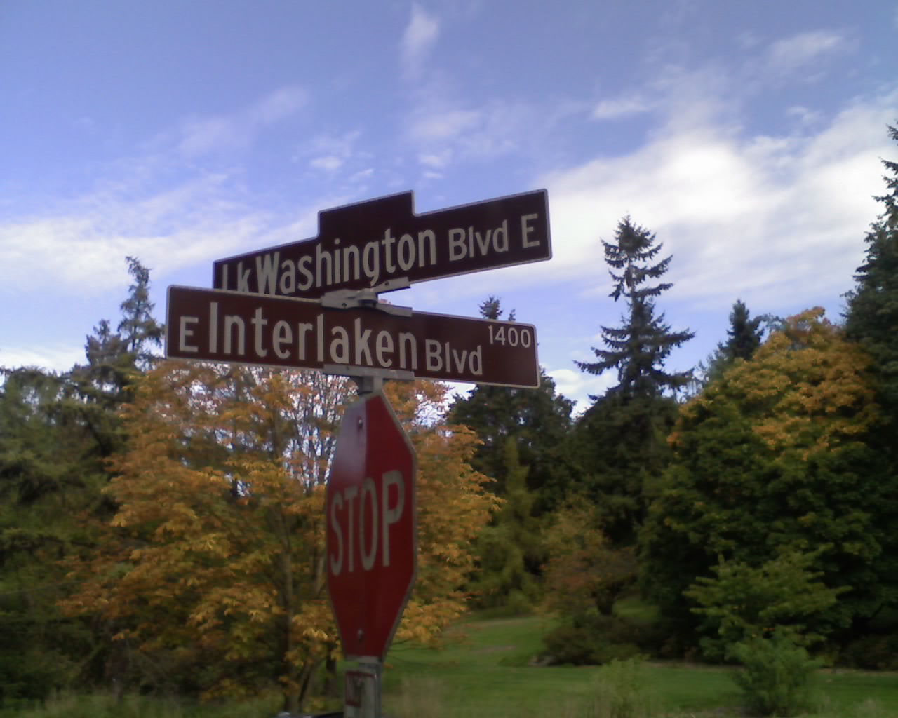


Actually, not all of the Seattle blades are brown, just the ones on Seattle's network of Olmstead boulevards, those city-spanning parkway blvds like Ravenna Blvd or (as above) Lake Washington Blvd and Interlaken Blvd that were inspired by the Olmstead Brothers' park plan for Seattle.

Ben points out that this change has been in the works for a while:

Yet it turns out that we approved this project in 2006 as part of the Bridging the Gap levy. Since then we've begun replacing signs at all our nearly 13,000 intersections, as the aluminum ones installed in the 1960s have definitely begun to show their age, and the new fiberglass batch is larger and more reflective. In a sense, we're finally catching up with the rest of the country. Our timing may not have been perfect, but we'd better pray for strong stomachs, because this project is scheduled to go, according to a report in The Seattle Times, until 2016. (On the bright side, that leaves plenty of time for you to pick up your favorite old sign at the city's surplus warehouse.

The material appears to be the same that we here in PDX are seeing going up on our new street blades.

The new Seattle design not only includes a design for streets and roads but also for pedestrian stairways and paths that happen to be in the streets right-of-way and trails (such as the Burke-Gilman Trail), with a walking-man pictogram similar to the ones we see on our walk-signals. Very nifty.

Ben does point out that, as I've seen in Portland, some mistakes are obtaining. No misspellings yet, but directionals are being left off and some signs are a little inscrutable.

It is becoming apparent that Clearview, the font, is catching on all over. Seattle's signs are using it too, and the reputation of mixed-case type is being forewarded thereon.

The real gem is that Ben links two other of us Address Nerd (or sign-obsessives, if you will). The other one is one whom I've enjoyed, Morgan Wick; the other is, of course, my own self. It made my day when I saw he linked me to the work "odd", which made me laugh out loud.

Address nerds go viral? Maybe. And here I thought I was the only one, when I started. Nifty.

Ben's full flickr stream is here. Also very nifty. Don't miss the "Gently Used Kids Sale" while you're at it. That Seattle – so inscrutable.

Technorati Tags: , , , , , , ,

28 October 2009

[art] Drawing Comics With Doug TenNapel

2250.Doug TenNapel gave you Earthworm Jim and GEAR, and now he gives you about ten minutes or so of his time to show you how he does what he does and talk about storytelling:


What is interesting about TenNapel is, with just about everybody (up to and including Scott McCloud and Scott Adams) using graphics tablets to get the job done, TenNapel kicks it old-school – at the drawing board, inking in pencilled panels on Bristol board using Sumi-e ink.

His remarks about using a Cintiq (for which I would kill everyone's grandparents to own) versus drawing to complete a story were insightful and revealing. He draws for the same reason a lot of us draw. Drawing is, amongst other things, sensual as well as sensuous. The adjectives he use approach carnal; the feeling of laying down graphite and ink on paper is indeed seductive. While telling the story is part of what feeds his head, unless he's actually drawing the drawings and filling them in with brush and ink, it's kind of empty. There's a decided lack of kinesthesia there; and while computers can make comic artists mad efficient and productive, there's a decided feeling of separation from one's work.

In the excellent Making Comics, Scott McCloud mentions a moment when he went out, bought a two-dollar (plus tax – the man lives in California, I do believe) roller ball pen, a Pilot Precise (the only pen worth owning) V7 (I prefer V5, but that's just me) and dashes off a sketch with it, making the point that if you really want to draw comics, computers may be the bomb and heaven for you, but you can do it with a scrap of paper and a pen off the shelf.

If you want.

Technorati Tags: , , , ,

27 October 2009

[liff] Neologism Of The Day: Hangoversight

2249.Another new work for y'alls:

hangoversight (n): The factfinding process a drinker puts themselves through analyzing (as best as they can) the things they might have done to prevent the horrible way they feel the morning after the night before. Assaying and measuring the dog that bit you regardless of the hair that it grows.

"Man, Gina really tied one on last night, but after a bit of hangoversight she decided that next time, there will be no mixing that tequila and that rum. Bad mojo on her part!"

Technorati Tags: , ,

26 October 2009

[liff] Neologism Of The Day: Oopsienounce

2248.New word for y'alls, and one what I just camed up with:

Oopsienounce (v.t.): to accidentally let slip that something was going to happen before you meant to announce it, or to admit inadvertantly that you know something that you were trying to keep under wraps. The loose lip sinking the ship. Portmanteau of oopsie and announce. Noun version: oopsienouncement.

Ex. 1: When New York Times publisher Bill Keller spoke on the future of the Times as a visual medium, he oopsienounced that Apple has the debut of a tablet Macintosh impending.

Ex. 2: Kari Chisholm of Blue Oregon noted today that GOP Gubernatorial hopeful has oopsienounced his campaign in advance of its anticipated late-September debut.

You're welcome, Noosphere.

Technorati Tags: , , ,

24 October 2009

[type] letterPLAYGROUND: Type Play For The Peoples

2247.What is letterPLAYGROUND?


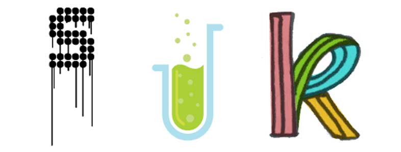
It's just what it says it is. No fancy web-based application, just a site where you and I and everyone we know can riff on letterforms, make them art, upload them, share them, and have fun.

It's type, it's art, it's playtime.

You oughta check it out. Any graphic program, any level of artistic skill, any wacky (or restrained) inspiration welcome:


(via the always-excellent Extensis. Featured: "S" by user srgworks; "J" by user jedrek; "K" by user {FBZ})


[art] YouTube Tutorial of the Day: How To Draw The Female Figure

2246.Might be a little NSFW, unless your boss understands that a drawing of a nude female figure is not necessarily pr0n. Teaches you proportions and where the general stuff's suppose to go:


… and here's a quick-sketch, time-lapse of an artist doing a female figure: http://www.youtube.com/watch?v=FMhnb09YjQI. Same edge-of-NSFW warning applies. Tell your boss that artistically-inclined workers make better problem solvers.

Actually, they do.

Technorati Tags: , , ,

[type] Now Mrs. Eaves No Longer Nods Lonely

2245.In 1996, the legendary digital typographer Zuzana Licko created Mrs. Eaves, a font which was an amazing OpenType revival of Baskerville.

Therein lies a tale.

When one looks into the life stories of the great typographers, one finds, as with lives of other artists of remarkable passion, complex personal lives. Eric Gill has proven to be one, and John Baskerville is no exception. From Emigre Magazine, issue 38:
Licko's selection of the name Mrs Eaves reveals an interesting story. Like his types, Baskerville was, himself, a controversial character. He hired Sarah Eaves as his housekeeper. Eventually her husband Richard abandoned her and their five children, and Mrs Eaves became Baskerville's mistress and eventual helpmate with typesetting and printing. On the death of Mrs Eaves estranged husband, she married John Baskerville within the month. Selection of the name Mrs Eaves honors one of the forgotten women in the history of typography.
Behind every great man was a great woman. In Baskerville's case, that was Sarah Eaves.

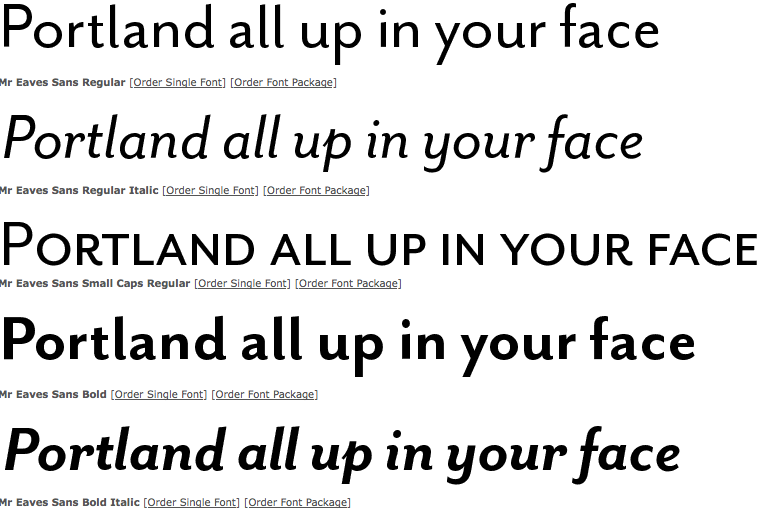
However, one not familiar with the history of Mrs. Eaves might wonder why there couldn't be a Mr. Eaves, to round out the symmetry (indeed, those familiar with the legend might also find it amusing). At the very least one wonders what a "male" version of this distaff font might look like. This monty, Licko released Mr. Eaves, answering the question:


The font Mr Eaves is designed to echo the style of Mrs Eaves but to be more than just a version of the Mrs with the serifs cut off. The ratio of x-height to ascender height gie an impression of classic style, just as with the Mrs, but the clean, modern lines give a current feel, something like a variation of Gill Sans or Myriad. The italic versions, with their obvious but dignified filips, seem to suggest a very refined sort of handwriting. I very much enjoy the curls-up on the bottom of the miniscule l's, and the leg on the majuscule R is something I'm silly in love with. This very much lives at the intersection of modern geometric fonts and humanist, designed fonts – a verson of it, Mr Eaves Modern, comes across as a warm version of Futura.


Graphic copyright Emigre

And now, Mrs Eaves and Mr Eaves live in perfect harmony, which you can avail yourself of at Emigre: http://www.emigre.com/EFfeature.php?di=213.

Technorati Tags: , , , ,

23 October 2009

[type] Laika – A Font That Dynamically Responds To You

2244.I've always felt that type is not as static as people think it is. Even printed, unchanging type has the power to move, influence and change moods (imagine a Last Will and Testament in Times Roman. Now, Imagine the same document in Comic Sans. How would that make you feel?)

In a video that has to be seen to be appreciated, Swiss typographers Nicolas Kunz and Michael Flückinger exhibit Laika, a font that was designed to transition seamlessly between any number of outside stimuli.

Art imitates life, typographically:

LAIKA from Michael Flückiger on Vimeo.

Laika can be further assayed at its website: http://laikafont.ch .

Technorati Tags: , , ,

[blog] My PDX Street Typography Photo Featured At Portland Building Ads And Other Vintage PDX Signs

2243.If you're interested in Portland streetscapes, funky found typography, and Portland visual history as I am, then you already have Portland Building Ads blog (http://pdxbuildingads.blogspot.com) in your blogrollio somewhere.

So, when the proprietor thereon asked me if he couldn't use this picture:


To flesh out a visual history of the corner of SW 17th and West Burnside, I naturally said "hells-to-the-yeah!"

Thanks to Dan for the query. I'm only too happy to assist, because when it comes to Portland visual history, I'm all over that. And flattered too!

If you like vintage type and vintage signs, too, he cited a local blogger who does vintage Portland sign reproductions. His name is Peter Vogel, he blogs at The Nutmegger Workshop: http://www.nutmeggerworkshop.com/, and the works on offer are supremely charming and attractive. So, go, do that thing there!

Technorati Tags: , , , , ,

22 October 2009

[liff] My Comedy Writing Won Me A Prize Today

2242.Well, admittedly, it wasn't a great deal of comedy writing, but famous cartoons have had shorter captions. It just gets down to what works.

All this month, graphic resource house Veer has been holding a series of Twitter contests. They tweet the contest out, and you respond by starting your tweet with "Hey @VeerUpdate" and then including whatever they need and if they select your tweet, during the daily contest you win a 1-month subcription to Veer Marketplace where you can get a scad of great high-quality photostock.

Yesterday's contest was creative contest #32, and the challenge was to caption this photo:


Thumbnail copyright Veer; you can purchase it yourself
by going to http://marketplace.veer.com/images/1589134


My caption:

It was moments like this that Dr. Doctor thanked God
he got a "A" in "Concerned Medical Looks 101" in Pre-Med.

Which won me the subscription (along with a few other lucky and talented souls). So, yay, me! The small triumphs are sometimes quite sweet!

Thanks, Veer!

Technorati Tags: , , , ,

[design] How To Layout A Comic Book Cover

2241.Ever wondered what it takes to create a decent-looking comic book cover?

Well, it takes Adobe InDesign CS3/CS4, Illustrator CS3/CS4, Photoshop CS3/CS4, and this tutorial from the most inspired design blog. It merges photographs and computer graphics to try to make a surrealistic connection between the comic world and the real world.

The result is this:


Why not give it a try?

Technorati Tags: , , , , ,

21 October 2009

[pdx] PDX Street Sign Shop, Ca. 1916

2240.Fellow street sign blogger Eric Fischer, whose San Francisco work I've praised, has done me a definite solid and dropped a very beautiful thing my way.

As I may have alluded to in another post somewhere, Portland's street  blades have looked different. From, I'd estmate, around 1900 through the middle third of the 20th Century, PDX Street blades where these indesctructable iron things, with white and enamel paint, which looked like this:


As you can see, it's very utilitarian. Blocky, almost-military letterforms – not graceful, but very very readable.

In a recent comment to the Cyclotram's P13 Stark Street Milestone, fellow street sign blogger from San Francisco (whose work I enjoy) Eric Fischer pointed me to a most amazing publication, in the public domain and available in its entirety on Google Books. It was in this book, Municpal Engineering Practice, by A. Prescott Folwell and published in 1916 by Wiley and Sons (a book generally about designing and laying out cities), that I found the following view – the inside of Portland's sign shop, ca. 1915 or so:


You have to embiggen this to see it in its full glory, to do this, go to Posterous here and click on the photo (which you can also download) or click on the photo above.

Lined up along the bottom there are signs for E. 70th ST. N (today's NE 70th Avenue), E. 72nd ST. N., 50th AVE. SE (today's SE Raymond Street), and 41st AVE SE (today's SE Gladstone Street). I also see a rather big blade, reading (on two lines) PATTON ROAD/COUNTY ROAD, and there are signs for CRYSTAL SPRINGS BLVD, WISTARIA AVE, and possibly a deprecated style for WASHINGTON ST.

To go over it real quick again, before the Great Renaming of 1933, numbered streets east of the Willamette and north of Burnside not only carried the East prefix because of that but also the North suffix to extend west-side naming practice east in a uniform way; therefore 11th Street east of the Willamette and north of Burnside would be EAST 11TH STREET NORTH. The avenues suffixed SE were in the area south of Powell and east of E. 39th Avenue which, for reasons even not yet clear, had number congruent to today's street blocks going out in both directions, though avenues ran east-west and streets north-south: therefore, 1916's 50th Avenue SE would be today's SE Raymond Street, which is the 5000 block (50th standard street name south of East Burnside) and 41st Avenue SE would be SE Gladstone Street – today's 4100 block (41st standard street name south of East Burnside).

The viewer can no doubt find some things that I've missed, and it's all interesting and good.

Thanks Eric … you definitely da man!

To view the page directly and download your own PDF of this book, surf to the following:

http://books.google.com/books?id=7AJLAAAAMAAJ&dq=%22street%20name%20signs%22&pg=PA295#v=onepage&q=%22street%20name%20signs%22&f=false

Technorati Tags: , , , , , ,

[type] Pen And Ink Journal - A Handwritten Blog!

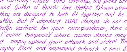
2239.Naturally, I'm hoping the headline got your attention. But it's not a joke – the blog Pen & Ink Journal, an actual blog at http://www.penandink-journal.com/ is an actual, surfable blog, and the entries are handwritten – in a beautiful, masterly handwritten script:


Naturally, she's not writing directly on the aether, but she's handwriting every entry and uploading them as a JPG graphic. What you see above it just a small sample of her masterful facility with handwriting.

She's a calligrapher named Lisa Ridgely, and you can see she's quite a talent by going to her site, lisaridgely.com, and just opening your eyes, kiddos. Her work is amazing and graceful, italic and swashful (but not too much), each letter and word drawn with an obvious eye for what's exactly right – not too much, not too little.

But at least stop by Pen & Ink Journal, because one thing that artists worry about is, is there a place for the handmade in the computer world, and Lisa proves that, indeed there is …

… with an honest-to-pete, handwritten blog.

Handwriters, rejoice!

Oh, yes, follow her on Twitter at @lisa_ridgely. I am. Via Creative Curio, of course.

Technorati Tags: , , , , ,

[art] The Best Beginner's How-To-Draw Book, Ever, By Bill Martin Jr

2238.This is, prima facie, an article about the best how-to-draw book ever made. There is a bittersweet note to it, though, which see at the end.

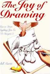
The Book: Artist Bill Martin, famous for incredibly detailed landscapes with a touch of whimsy and a touch of surrealism, produced a book first published in 1993, called The Joy Of Drawing. A slender book, it is nonetheless packed with great first steps. Martin's a great artist, and has a skill in communicating that is manifest here; through drawings and amazingly well-chosen words, within the first fifty pages you have a solid idea of how to draw what you see and how to look at what you see, which is skill number one for any artist.

Within those first fifty pages you also learn value, perspective, angles, proportion, how to indicate volume with blends, basic shapes which you can combine to draw basically anything. Bill Martin Jr's succinct writing style and apt illustration style ties it all together in a way that drives the point home more or less instantly. He even, in later sections of the book, show you what to look for in order to draw transparent and liquid-filled glass, two-point perspective, how to show contours using surface textures …

If I had enough money, I'd buy up every copy of this book that I could so I could give it out for free to anyone who wants to draw and doesn't think they can. This can help you out even if you just want to draw for fun, because doodling and scribbling about is fun enough, but making art works is quite liberating.

The Book is that good.

The Artist: Bill Martin, Jr, made a name for himself painting works that had great visual depth and wit, a feeling of realism and a feeling of surrealism – there is an airiness to his works that makes the paintings (many of which were painted on cirular canvases) feel at once like an Earthly landscape and also one might find on a distant planet just discovered by an Earthly explorer light-years from home. The landscapes run from the real to the fantastic. His work was known the world over and seeing what he knew about creating amazing landscapes suggest that he knew even more at understanding the real.

The Bittersweet Part: When I first discovered Bob Ross, the wet-on-wet painter to the masses, I found him ironically interesting like most people do when I started watching him in about 1998 or 1999. Little did I know, as I accidentally found out, that Bob died in 1995 at a very untimely age of lymphoma.

One can imagine how I felt when I heard that Bill Martin, Jr, died back in 2008, in his early sixties, of lymphoma. What a sad loss!

If I ever do hit the big time, you can believe that I will buy up as many copies of The Joy of Drawing as I can and give them free of charge, to anyone who asks. I'd even have another printing done.

The book is that good.

The ISBN is 0-8230-2370-2. It was publshed by Watson-Guptill back in 1993 originally.

If you find a copy, buy it and give it to someone you love who's aching to learn how to draw. You won't regret that.

Technorati Tags: , , ,

19 October 2009

[tech] SCO To Darl McBride: "You're Fired!"

2238.The Linux world has reason to celebrate today. Darl McBride, the master brain cell behind The SCO Group's "Sue 'em Into Oblivion" strategy has been deposed. Ars Technica:

McBride was the architect and public face of SCO's misguided campaign against Linux. He claimed that the open source operating system infringed on SCO's copyright and included a significant quantity of code stolen from UNIX System V. On the basis of this claim, SCO threatened to sue a multitude of corporate Linux users and demanded hefty licensing fees. During the ensuing litigation fiasco, an internal SCO memo was revealed which indicated that SCO's own internal code audits of Linux found no actual evidence of infringement. The courts eventually determined that SCO never even owned the relevant UNIX copyrights in the first place.

Even after SCO's deception was exposed and the company effectively lost its case, Darl McBride continued to insist that the company has evidence of System V code in Linux. No such evidence has been presented and McBride's argument directly contradicts testimony given by other SCO executives. McBride's stubborn detachment from reality has made him a subject of ridicule in the Linux community.

The SCO Group will, oddly, continue prosecuting its lawsuits (one envisions zombie lawyers), but while the mene mene tekel upharsin of the company hasn't yet been written on the wall, buzz I'm reading is that SCO is not long for this world.

This is  a bit off topic for my state-of-the-blog, but I've been following this for a while, and one of our machines has Ubuntu on it, and I like Linux, and I like my friends who run Linux. So, even though SCO hasn't given up on the litigation, this can't be any but good news … if only because teh Darl has gotten a well-deserved comeuppance.

Technorati Tags: , ,

17 October 2009

[pdx] Stark Street Milepost P13 …

2237.… atul666 can haz it, in Gresham:


… it's that little obelisk by the sign post. Probably knocked down by a road crew; lovingly replaced by the Gresham Historical Society.

The picture above is small and hotlinked (with apology to atul) to make you go and read his entry, which is highly skookum.

Cleveland Avenue (historically SE 235th Avenue) and Stark Street.

Check it.

Technorati Tags: , , ,

14 October 2009

[type] Free Typography Rules Poster PDF - With Solid Advice

2236.Since, according the The Book Of Tom Peterson (and Gloria Too!), free is a very good price, here's a nugget I turned up thanks to David Airey at twitter.com/DavidAirey:


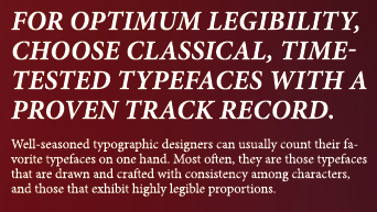
The poster, in PDF form at Minneapolis graphic designer Evan Stremke's site (http://www.evanstremke.com/index.php?/design/rules-of-typography/) is classily and elegantly designed and self-proves by using interestingly-laid-out typography to create its own interest. Every one of the rules mentioned is common-sense, and I've passed by them all in my education in typography. Here's a good one:


… and that's the stone truth. For all the insatiable collecting that type-lovers do, it's truly amazing how few type faces one really needs to get the job done. Any sufficiently creative layout artist can combine these and use other design tools and techniques – hierarchy, juxtaposition, what-have-you – to create interest and compelling approaches. As always, context is key: there is a time for Helvetica Neue, there's a time for Myriad Pro, there's a time for Hobo and Cooper Black, even. I suppose there's even a time for ITC Matisse, but I just hope I'm out of town when that time comes. Better still, it should come in Redding.

And to encourage you to download the poster, I'd direct your attention to the very last rule, which is what you need to know once you've learnt all the others. But … soft you now! … download the poster.

The PDF is free, but you have to print your own poster. Oh, well, nothing's perfect, bunkie. It's great design anyway.

Technorati Tags: , , ,

13 October 2009

[liff] TEOTWAWKI Follies: The World Won't End On 12/21/12, Says A Real Mayan

2235.Says an actual Mayan tribal elder:

Definitely not, the Mayan Indian elder insists. "I came back from
England last year and, man, they had me fed up with this stuff.

I know you you feel, fella.

But why believe him when you can believe a non-Mayan who acts like they know it all?

Technorati Tags: , , ,

[pdx] More Proof That PDX Is Unicorn City, USA

2234.Via Twitterer BlazersEdge, we find even more evidence of Portland's privileged position as being built atop an ancient Unicorn burial ground: we attract bball players who are actual Unicorns. Here is a picture of forward Jawan Howard, recouperating from a successful horn removal:

juwan howard underwent successful unicorn horn removal surgery. on Twitpic


Now, as righteous as it is that Portland is on the site of the Unicorn burial ground, it'd be positively awesome to say that you actually were a Unicorn.

But we can see how that'd get in the way on the court. It's best this way.

They grow back, anyway.

At least, I think they do.

That's what I hear.

Good luck on the season, Jawan.

Technorati Tags: , , , , ,

12 October 2009

[type] Kerning … It's Just Rhythm (Without The Blues)

2233.Kerning: the one typographical power word. You can have anything you want going down with your type, but watch that kerning …

Kerning addresses a basic problem with our alphabet: The shapes of certain character pairs create spacing problems, making them appear either more loosely or more tightly spaced than the neighboring characters around them. To create the even and consistent spacing between characters that makes for pleasant reading, you should iron out these spacing anomalies.

Kerning isn't letter-spacing, it's how you do the letter spacing.

The above is from this CreativePro article by James Felici (http://www.creativepro.com/article/one-good-kern-deserves-another) that takes you around the subject of kerning and why you do it; tells you in real simple yet complete terms about kerning pairs.

Kerning is just one of those basic things that you learn when you learn design and it's something you keep an eye for from then on.

Technorati Tags: , , ,

11 October 2009

[art] How To Draw A Good Looking Eye

2232.Here's looking at you, kid.

I find a lot of people who aspire to draw and are disappointed at the result become disappointed because they are not drawing what they see, but what they think they see.

Here's an example. Say you want to draw an eye (go ahead, say it. I'll wait … okay. Back.). You might want to try it now. How did you do it? Did you think of eyes you have seen, remember what  you saw, or did you put down an up-curve, a down-curve, and a couple of circles in the middle?

If you did, you did what I think of as iconic drawing. I have a theory, based on my own experience in drawing, that what we do when we draw things from life like faces and rocks and trees and such is we all have this visual library of icons that we "draw" on when we want to draw something. Before we learn how to see things as an artist does, though, that visual library overrides whatever skill we have, and we either cough up the icon or some odd hybrid of the icon and what we see.

This is not a sin. As a matter of fact, as creatures who have to survive on a visual level, I think it's a pure survival skill. But it's something that will sabotage you as an artist, because if you have to try and try and try to override your visual librarian, you'll get discouraged. That librarian is very good at its job, and it doesn't lay down placidly and take a break. Maybe it heard there's a recession on, who knows.

This is why drawing from life is something everyone who aspires to art should attempt. It's painful at first. I remember the first few times, how it felt to force myself to make the motions (life drawing is a physical thing) and how it felt to disconnect from that visual librarian (in the end it was a necessity; the librarian wasn't writing my grade for the course, the instructor was, so the instructor had veto power). Also, for a lot of people, it's awkward standing in a room of strangers, looking at this nekkid stranger come up and then learning to draw what you see, learning the kinesthetic motions. But then you get in the zone and it's pure, and you realize you're learning the same thing that artists over a thousand years do, and it's liberating.

I told you all that to tell you this: Manga-ka Mark Crilley has a great short video I wanted to share (via here) that combines the two. It stars from observations from life and puts the visual librarian at their service, instead of the other way around, but even though it uses the icon library for bits, the whole thing is based on life drawing observations and experience (as the artist himself makes plain at the front of the thing). If anyone should know about drawing eyes, it's a Manga-ka, but the life drawing referent makes sure it all stays true and realistic:


There you have it. Realism and knowing short-cuts. You probably learned a quick skill or two if you followed him.

Technorati Tags: , , , , ,

[logo] What If Logos Used Comic Sans?

2231.Here, we keep beating up on Comic Sans (which, as history will show, Vincent Connare designed for Microsoft BOB), which is a little unfair, because Comic Sans didn't really spread itself everywhere, but someone asked themselves the eventually unavoidable question, what would famous logos look with it?

Well, I would. I think logos.

How about UPS?


If that didn't make you cry and die inside:


View the rest at http://jacovox.com/2009/09/logos-famosos-hechos-con-comic-sans/. It's all in Spanish, but you won't need to habla to have the images sear your soul have a great laugh.

(Via)

Technorati Tags: , , ,

[liff] Literally Giving Of Yourself: Donating Blood

2230.Latterly I, for the first time in my life, donated blood.

As someone who is always critically short of funds but wanting to do at least something good and altrustic, I try to find ways I can give of myself. When you donate blood, this is literally what you're doing. And you hear a great deal about how giving blood helps, but I found some nifty figures that tell you exactly how your blood donation might help:
  • One blood donation can help save up to 3 lives.
  • You can consider yourself elite: only 3 percent of the US population who can, does.
  • If you do it twice, consider yourself doubly elite: less than 30% who give once give again.
  • Donated blood has a shelf-life of about 42 days.
  • Every 2 seconds someone in America needs your gift.
  • You can give blood up to 6 times a year.
If you just want to do something selfless, and would give scads of money to worthy causes if you only had it, you can give blood at any income level and whatever politics you play, whatever creed you follow, whatever color your skin is, no matter how smart you, no matter what you think.

My blood type is O+. It's the most common blood type in America (about 38% of the populus carry it), and if you think that having a "common" blood type makes you unremarkable, that ain't true, kiddo; since more people have it, more people need it. It'd be bragging rights to have a rare blood type, but this is one place where you're even more important if you're Everydude. You also do more for everyone as Type O, because every blood
type can accept Type O (especially Type O-, which they call the
"universal donor" and is actually about the rarest, so, yeah, you can
brag about that one mah dawgs).

Strangely, the stats I checked tell me that where almost 40% of Americans are Type O+, almost fifty per cent of Saudi Arabians are. Things that make you go hmmm, yes?

Anyway. Everyone has blood. Almost everyone can give blood. It's as easy as going to the Oregon Red Cross and finding out where to do it (or they can direct you to the nearest blood drive – just click on where it says Give Blood). If you prefer not to do it via the webby thing, the Oregon Red Cross headquarters is located over near Emanuel Hospital, at 3131 N. Vancouver Avenue. Call them on the ringy-dingy-thingy at 503-284-1234.

I now wear that little plastic blood-drop with the Red Cross logo on it with offical ZehnKatzen Smug Pride™, which I think you're entitled to if you know your donation is going to save up to three people's lives.

This is something every human being who can, should do.

Technorati Tags: , , ,

[address_nerd] Zero Hundreds Go Viral A Little Bit

2229.Long-time blog readers (I think I might have a few of you) may recall that I expounded at-length about the curiosity of addresses in Portland with leading zeroes in the house number – what I called the zero-hundreds, in that area of Southwest that's not east of the river (so it can't be Southeast) but it's east of the zero baseline (so you've got to be able to tell that somehow).

The abstract: as you clear the Naito Parkway line going east but approach the river, the addresses increase block-by-block, but have a zero prepended to the house number; where an address three blocks west of Naito on, for instance, SW Porter Street might read 200 SW Porter Street the same street three blocks east of Naito would read 0200 SW Porter Street.

The entire system is described in this entry I made on 20 July 2005: http://zehnkatzen.blogspot.com/2005/07/geography-address-nerd-on-zero-hundred.html. Go there for a more complete description. Break out any map of Portland for a good look at the layout of the area (you can use Google Maps, but they leave off the leading zero (just remember it's there, okay?).

I figured out eariler today that, via my SiteMeter report (I'm poor, so I just look back at the last hundred) the posessor of the LiveJournal here (at least, this is the earliest one I can find within that hundred-post limit) posted a very succinct yet very cool link to that original Address Nerdery.

One thing I love about blogging is that, in my obsessions I sometimes answer a question for myself that becomes an answer for a question someone will have sometime down the road, at any time that may or may not happen. I love the ordering of a well-formed address grid, but without randomness, order is meaningless, so viva la Chaos!

And you know what else? It's spread out just a little bit on other LJs and on this LJ-esque service called Dreamwidth, which is an artistic sort of LJ, which is even more thrilling.

It makes me feel all unicorny and antic inside. And I'm flattered, too.

Technorati Tags: , , ,

09 October 2009

[type] Font Bureau to NBC: You Been SERVED!

2228.Unlicensed fonts are something that every designer tries to avoid. But fonts are so pretty … so … shiny …

ahhhh …

Oh! Where was I?! Anyway, there have been some high-profile font cases in the past. What usually happens is that a company, organization or individual buys some digital type, and the typical license allows the purchaser to install on a limited number of computers (usually just one; you have to pay for a license for each computer that will use the font). Now, with fonts being digital files that are so easily copied about, its understandable that sometimes a single user will carry a copy of his or her fonts somewhere else.

But when a media company – who should know all about creative rights and IP – does it, it redefines awkward.

Allow me to introduce you to the newest member of the Legally Awkward Hall o' Fame: The Peacock:

It seems NBC didn't secure the rights to use a handful of Font Bureau's trademarked typefaces. The same ones, we should add, that have been used as part of NBC's fall marketing campaign to tout shows like The Jay Leno Show, Saturday Night Live and Late Night with Jimmy Fallon.

In a trademark and copyright infringement lawsuit filed in U.S. District Court, Font Bureau argues that NBC only paid for a single license—which would only permit the company to install the typefaces on a single computer—and only paid to use a limited number of fonts. But NBC went ahead and copied the fonts to a bunch of other computers within the company, Font Bureau claims, and also started using several other fonts for which licenses were never obtained. (In case you're wondering, the typefaces in question include Bureau Grotesque, Interstate and Antenna.)


Like I said, awkward.

This is going to try to cost them a bit of change … only about, oh, 2 Megabucks. Pocket change, really. Cancel Heroes, which I hear is on its death bed anyway, and you have your scratch right there.

Hey, I'm pretty good at this TV stuff! Hire me! My first project: the long-awaited Space:1999 revival …

You're gonna like it. Shut up, you!

And go check your font licenses while you're at it.

Technorati Tags: , , ,

08 October 2009

[design] What Is Graphic Design?

2227.This nifty little short will tell you what graphic design is the best way anything can – you'll react to it.


… if you got a message communicated, that was graphic design. It's art and typography and color and hierarchy and awareness and juxtaposition all designed to bridge the realspace gap between the communicator and the communicated.

It's simple and its complex, and it's endlessly interesting.

(via twitter.com/LyricalReckoner)

Technorati Tags: ,

[pdx] Where's The Best Damn Horchata In Portland?

2226.Those of you familiar with good Mexican cooking know that when it comes to sweet things, Mexican cuisine has the most amazing things. A serving of flan, for instance, is pure heaven. And perfect horchata is beyond words.

Horchata is made of many things, but when you say that locally, what you're saying is rice milk with a Mexican accent; cinnamon and vanilla. And there's a lot of pedestrian horchata out there, it's not hard to find. A couple of days ago, though, we found heaven in a cup off SE Hawthorne Blvd, in the hip section.

It's not hard to find Mexican roach coaches in Portland, but this one is a little hard to find, so I'll direct you. Behind the Dollar Scholar at 33rd and Hawthorne there's a little pocket parking area; SE 33rd Avenue between Hawthorne and Madison itself looks like an alley. It's a few steps out of your way, but worth the trip. Tucked in behind the Dollar Scholar is the Neza Mexican Food Cart, with a friendly little staff that is clearly family.

Nearly all the food there is in the $3-$4 range, including the quesadillas, that came in pork (which The Wife™ had) and steak (which I had), which will take the edge off the most demanding appetite. They have a limited menu which includes burritos, tacos, all of which looked very satisfying. I have no complaints whatsoever about the food – it was very good.

But it was the horchata that'll keep me coming back. Perfect, creamy, sweet-but-not-too-sweet – just like every good Mexican sweet food – it had a strong vanilla note that the cinnamon played a supporting (but strong) role in. I like vanilla more than cinnamon, and this all worked very well. And while some horchatas leave kind of a coarse texture on the tongue, this was well-blended, smooth, and felt very nice in the mouth.

So there you have it. You want great horchata,  you go to Neza. It's a few steps off Hawthorne, but more than worth the detour.

Technorati Tags: , ,

[pdx] It's Like A Second-Hand Store, Except That Everything's Free

2225.There's a new player in the 12th and Hawthorne Cart Zone, which has actually been expanding of late.

Among the cart pods in the City, the one at 12th and Hawthorne is, if not the most famous, the one with the most community. Going down for a Whiffie's pie or an El Brasero chorizo burrito or a cup of Yarp's noodles means you get to sit and watch a lot of interesting night people (well, at the hours we're likely to be there).

The pod there has gotten so successful that it's actually spawned a satellite at the corner of SE 11th and Clay, one block south and one block east, on the opposite side of the Burgerville. There's an Airstream trailer there – the Empress Diner – and Northwest Hot Dogs. And now, in a painted bus, also at 11th and Clay, there's the Portland Free Store.

The website is http://www.freestoreportland.org/, and they Twitter at twitter.com/freestorepdx. The tagline It's like a second-hand store, except that everything is free seems to sum up thier business model succinctly. And it seems to be something of a movement; on the Free Store Portland webpage is a shout out from the Free Store Tulsa (yes, the one in Oklahoma).

It's a charming concept – kind of like the ArtBox on SE 20th by Colonel Summers Park, except that you might actually want what's in it. And an old painted school bus? What's not to like here? Looks like a unique way to support Portland's DIY and share-and-share-alike culture.

Oh, they're going to be on KGW's Live@7 tonight, so hey, you might want to check this out.

Technorati Tags: , , , ,

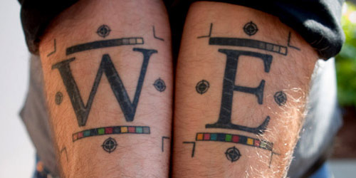
[design] Hardcore Prepress Artists Get Tats With Crop Marks

2224.(Yes, I've moved off count again, meaning that there are at least three duplicates down the stream there. Ah, well).

How do you know you're hardcore prepress?

How do you tell the world that you'll quit electronic layout when they pry your Mac from your cold, dead hands?

How does a hardcore designer represent?

With ink, of course:


Photo via The Font Feed. Copyright belongs to them.

Via Jurgen Siebert at The Font Feed:

Long time Adobe InDesign product manager Will Eisley is so dedicated to his job that it has gotten under his skin – quite literally. Will recently had his initials tattooed on his inner forearms, together with the regis­tration marks, crop marks, and colour and grayscale bars which are part of InDesign’s printing marks.

I think they're beautiful, even though the color and grayscale bars happen inside the crop marks, which will cause trouble when his arms eventually do go to press, but that's what you get when you don't sign off on a press check, even I know that.

Find another better picture and what Will wants to have tattooed next at The Font Feed
. Also a few snarky comments. My favorite:
The dude has his color bars inside his crop marks… He might be a quark user, or even worse.. corel..
Oh, snap!

(from a RT via @Extensis on Twitter. Love Extensis.)

Technorati Tags: , , ,

07 October 2009

[pdx] More Portland Milestones

2220.As pointed out by Cyclotram's Atul666 in the previous post's comments, there are more milestones around Portland than just the ones on Stark Street.

The reading I did on Stark Street Mile Markers blog suggests that there could well have been a system of mile markers on all four major routes into and out of the city. Not just east (Stark Street) but West (Canyon Road), North (Saint Helens Road) and South (Capitol Hwy) as well.

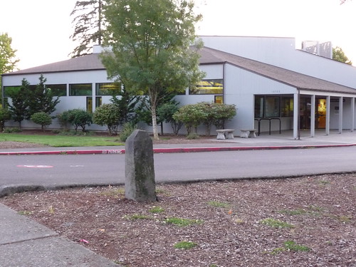
Stark Street's markers seem better preserved than the rest. The claim gains a measure of credibility when we find that there's another P7 milestone – but which is preserved today, perhaps not exactly in its precise position, at the corner of the property on which the Multnomah County Library's Capitol Hill Branch now stands:


See the tagged Flickr stream containing the above photo, taken by Chris_G_OR, hereabouts. It's got bits of history in it that make for intriguing reading (such as, e.g., the name "Taylors Ferry Road" used to go down what we now consider Capitol Highway).

Technorati Tags: , , , ,

05 October 2009

[pdx] The Stark Street Milestones

2219.Some time ago I fancied going out and finding milestones along SE Stark Street. The one I found looked like this:


This is on the northwest corner of SE 117th Avenue and Stark Street, at the corner of Ventura Park. As it turned out, there was a whole system of these small obelisks along Stark, going from the Willamette River at the east slip to the Stark Street Ferry (how you got across the river there before there was a Morrison Bridge) all the way out to what was to become Troutdale. Each small obelisk contained the letter P with a number representing the mile; P7 is 7 miles out. Stark Street – then, Base Line Road to signify its alignment along the Willamette Base Line – was one of the main routes into and out of Portland, connecting as it did to the old Columbia River Highway through Corbett and thence east to The Dalles, Hood River, and points east.

My plan was to find each one that the explanatory sign at 117th and Stark said were still extant and photograph them. As it turns out, some others are already doing this (hey, no foul; I can still go out and do it – and now I have a guide).

Atul666 at the blog Cyclotram had the same idea, and he'd been having just a little more luck than I did. He found milestone P5 in Montavilla, at the corner of SE 78th and Stark, tucked behind a dumpster (I've hotlinked this image):


Atul has also found P2, embedded within the wall of the Lone Fir Cemetery, near 23rd and SE Stark. You can read his words about it at http://cyclotram.blogspot.com/2009/10/milestone-p5.html.

But someone who's done the yeoman's job about this was someone identifying himself simply as Jeff at the blog http://starkstreetmarkers.blogspot.com/. In only two witty posts, he explores the idea of the Willamette Meridian and Base Line, and the idea of milestones along not just East but North, South, and West roads into and out of Portland.

Thanks to Jeff, I have pictures to go take and prattling to do. What Jeff did is, no more and no less, a public service.

Technorati Tags: , , , , ,

[packaging] I Can Haz Canned Cheezburger Naow

2218.We are not entirely unfamiliar with the efficacy of canning food to make it travelable and extend shelf life, and although the idea of finding imported Heinz Treacle at the Hawthorne Fred Meyer (that has to be boilt in the can before being eaten) is note completely bizarre to us (though it is a bit alien), there are some things that take it a bit far.

Presented for your delectation, the Trek'N'Eat Cheeseburger in a can, designed for those who spend a lot of time in the outdoorsy, presumably miles away from the nearest fast food dive. Contained within a can of indeterminate size (but appearing to be about the same size or perhaps a little bigger than your standard can of tuna fish), the burger is prepared by heating the can in a hot water bath, removing said can, opening the lid, and then (and this is the important step) enjoying your cheeseburger.

And if this isn't nifty enough, the foodstuff (for what other word could perforce apply) has a shelf-life of about a year.

But my unease really has nothing to do with the idea of a cheeseburger in a can, having eaten my fair share of freeze-dried Mountain House food during my time as a Boy Scout, but rather the illustration, nicked from the Trek'N'Eat site and decorating this very post. Look at that burger. Do you, for one minute, think that it came out of that can? Do you, you cynical consumer of culture you, need to be reminded that there's such a thing as food stylists?

I cannot believe there is one chance on this good green Earth that such a perfect looking cheeseburger came out of that can. Now, note that I'm not saying that whatever comes out of that can isn't edible or even delicious. But the marketing, while skillful, is a little hard to believe.

But man, I'm curious as to what that thing looks like and tastes like. You bet.

Technorati Tags: , , ,

03 October 2009

[oregon] Oregon Capitol Mall Postcards, ca 1955

2217.Anyone who knows me knows I'm silly in love with my native state's great Capitol building. Everything about it is nifty, from the golden Pioneer atop to the cylindrical cupola to the strong vertical lines. The Wikipedia article on it says the style is Art Deco, but it looks modern yet timeless because of the simple dynamism of the lines.

It is the fourth-newest state capitol building in the US, having been finished in 1939.

Yesterday, The Wife™ found two gorgeous post cards, which I gather (based on the styles of the cars and some of the state of the architecture) were made sometime in the latter half of the 1950s. This first one is a view toward the south, taking in the State Capitol from the roof vantage point of the Transportation Building (two blocks north and just east of the Capitol, on the east side of Oregon's Capitol Mall:


This next one is very telling:


The Capitol itself is significantly smaller, and there is a building that should be there, in the upper left, that isn't. Here's the scoop on that:
  1. The Oregon Capitol Mall, prior to about 1980, was defined by Winter Street NE (on the west), State Street (on the south front of the Capitol), Capitol Street NE (on the east), and Center Street NE (on the north. Leading away from the north end of the mall was Summer Street NE, which devolved into West Summer Street NE and East Summer Street NE, which circulated traffic about the Mall itself. Latterly, West and East Summer have been turned into pedestrian malls, and the street running across the center of the Mall – Chemeketa Street, NE – now serves an underground parking area which runs the length of the Mall. No auto traffic now accesses the Mall area except via Court (the street in front of the Capitol) and Center.
  2. Particularly in the second card we can date the scene. Obviously the photo was taken before 1977, when the Capitol expansion project extended the building's wings west and east and added to the back – this space primarily for legislator's offices. But on the block in the upper left of the Mall, where there appears to be a church, is now the Oregon State Labor and Industries Building, which was finished in 1961 (the Bureau of Labor and Industries, the original tenant, now is based at the State Office Building in Portland; the building itself is home to part of the State Insurance Division).
For reference's sake, the extant buildings on the Capitol Mall in the picture above are: the Oregon State Library, to the Capitol's immediate left: right-upper, the Transportation Building; right-lower, the Public Service Building. Dynastic changes have caused original tenants to change or move to other buildings entirely; the Mall itself now has expanded northward about twice its original dimension along both sides of Summer Street, NE as far as D St, NE.

If you want to embiggen them, see Posterous here:
http://zehnkatzen.posterous.com/vintage-1950s-oregon-state-capitol-postcards

Technorati Tags: , ,

02 October 2009

[pdx] The Tom Peterson & Gloria's Too! Coffee Mug

2216.Those who know me know that one of my cherished (and most unattainable) dreams would be to find, at a bargain price, The Tom Peterson Alarm Clock.

That we shelve to the status of a cherished dream still, however, on Wednesday, in a vintage shop on upper Hawthorne, me and The Wife™ found this little darlin' for just a couple of bucks:


And, yes, it's in use right this second. Yummy coffee!!!

(Yes, I am a connoisseur of the history of Tom Peterson. Just put that string in the search box up top and you'll see my compiled notes on the subject).

Technorati Tags: , , , , ,